LoadRunner analysis Problem detection & Auto correlate Graph
LoadRunner Analysis: How to pinpoint the source of the problem?
The Auto-correlate tool can merge all the graphs that contain data that could have had an effect on the response time of the check_itinerary transaction, and pinpoint what was happening at the moment the problem occurred.
1. From the graph tree, select the Average Transaction Response Time graph.
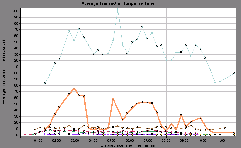
Look at the check_itinerary transaction, particularly at the slice of elapsed time between 1 and 4 minutes. The average response time started to increase almost immediately, until it peaked at nearly 3 minutes.
Right-click the graph, and select Set Filter/Group by.
In the Transaction Name Value column, select check_itinerary.
Click OK.
The filtered graph displays only the check_itinerary transaction and hides all the other transactions.
2. Filter the Average Transaction Response Time graph to display only the check_itinerary transaction
Right-click the graph, and select Set Filter/Group by.
In the Transaction Name Value column, select check_itinerary.
Click OK.
The filtered graph displays only the check_itinerary transaction and hides all the other transactions.
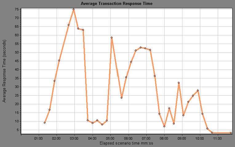
3. Auto-correlate the graph.
Right-click the graph, and select Auto Correlate.
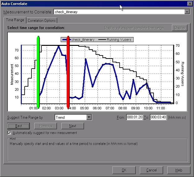
In the Auto Correlate dialog box, make sure that the measurement to correlate is check_itinerary, and set the time range from 1:20 to 3:40 minutes - either by entering the times in the boxes, or by dragging the green and red poles into place along the Elapsed Scenario Time axis.
Click OK.
The auto-correlated graph opens in the graph viewing area. The check_itinerary transaction is highlighted.
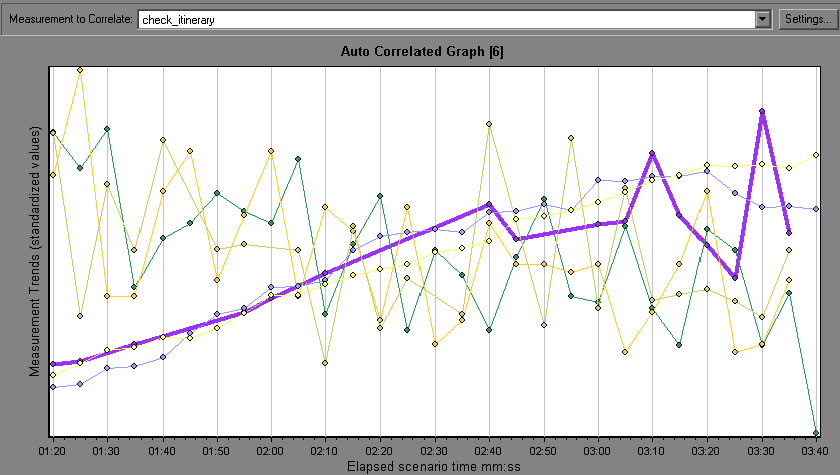
The auto-correlated graph is given a default name, Auto Correlated Graph [number].
4. Rename the graph
In the graph tree, right-click the Auto Correlated Graph [number] graph, and select Rename Item. The graph name becomes editable.
Type Auto Correlated - check_itinerary and press ENTER, or click anywhere in the Analysis window.
5. Analyze the auto-correlated graph
Look at the legend below the graph.

In the Measurement column, you can see that the Private Bytes and Pool Nonpaged Bytes, both of which are memory-related measurements, have a Correlation Match of over 70% with the check_itinerary transaction. This means that the behavior of these elements was closely related to the behavior of the check_itinerary transaction during the specified time interval.
We can conclude that exactly when the check_itinerary transaction’s response time peaked, there was a shortage of system memory resources.
What other information can I gather about my scenario run?
In addition to the graphs that appear in the graph tree at the start of an analysis session, you can display different graphs to get other information about your scenario run.
Display a new graph.
Click the Add New Graph button on the toolbar, or select Graph > Add New Graph.
The Open a New Graph dialog box opens and lists the categories of graphs that contain data and can be displayed.
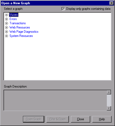
- Vusers. Displays information about the Vusers and their status.
- Errors. Displays error statistics.
- Transactions. Displays data about transactions and their response times.
- Web Resources. Displays hits, throughput, and connection data.
- Web Page Diagnostics graphs display data about each monitored Web page in your script.
- System Resources graphs display system resource usage data.
In the Open a New Graph dialog box, click the “+” next to a category to expand it.
Select a graph and click Open Graph.
Click Close to close the Open a New Graph dialog box.
Now open several additional graphs to understand more about your scenario run.
|About Load Runner |Creating scripts in Load Runner |Load Runner scenario |LR Analysis |Performance Tuning |Performance Testing |LR Errors |Interview Question |Load Runner Tool |Correlation Practice |Site Map |