LoadRunner Analysis: How do I graphically view performance?
You can access available graphs from the Session Explorer pane. You will now view and analyze the Average Transaction Response Time graph.
1. Open the Average Transaction Response Time graph.
In the Session Explorer under Graphs, select Average Transaction Response Time. The Average Transaction Response Time graph opens in the graph viewing area.
Note: If no graphs are displayed in the Session Explorer pane, right-click the Graphs node and select the Transactions: Average Transaction Response Time node in the Open a New Graph dialog box. Click Open Graph to add the graph to the Session Explorer pane.
In the Graph Legend pane, click the check_itinerary transaction. The check_itinerary transaction is highlighted in the graph and in the legend below the graph.
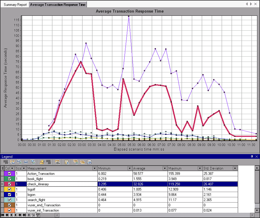
The points on the graph represent the average response time of a transaction at a specific time during the scenario. Hold your cursor over a point in the graph. A yellow box appears, and displays the coordinates of that point.
2 Analyze the results.
Note how the average response time of the check_itinerary transaction fluctuates greatly, and reaches a peak of 75.067 seconds, 2:56 min. into the scenario run.
On a well-performing server, the transactions would follow a relatively stable average response time. At the bottom of the graph, note how the logon, logoff, book_flight, and search_flight transactions follow a more or less stable average response time.
Server Performance (Did my server perform well?)
In the previous section you saw instability in your server’s performance.
Now you will analyze the effect of 70 running Vusers on the system’s performance.
1. Study the behavior of the Vusers.
Click Running Vusers in the graph tree.
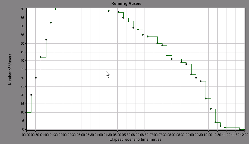
The Running Vusers graph opens in the graph viewing area. You can see that there was a gradual start of running Vusers at the beginning of the scenario run. Then, for a period of 3 minutes, 70 Vusers ran simultaneously, after which the Vusers gradually stopped running.
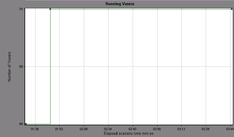
2. Filter the graph so that you see only the time slice when all the Vusers ran simultaneously.
When you filter a graph, the graph data is narrowed down so that only the data for the condition that you specified is displayed. All other data is hidden.
Right-click the graph and select Set Filter/Group By, or alternatively, click the Set Filter/Group By... icon on the toolbar.
In the Filter Condition area, select the Values column of the Scenario Elapsed Time row. Click the down-arrow and select a time range from 000:01:30 minutes to 000:03:45 minutes. Click OK.
In the Global Filter dialog box, click OK.
The Running Vusers graph now displays only those Vusers running between 1:30 minutes and 3:45 minutes of the scenario run. All other Vusers have been filtered out.
3 Correlate the Running Vusers and Average Transaction Response Time graphs to compare their data.
You can join two graphs together to see the effect of one graph’s data upon the other graph’s data. This is called correlating two graphs.
For example, you can correlate the Running Vusers graph with the Average Transaction Response Time graph to see the effect of a large number of Vusers on the average response time of the transactions.
Right-click the Running Vusers graph and select Clear Filter/Group By.
Right-click the graph and select Merge Graphs.
From the Select graph to merge with list, select Average Transaction Response Time.
In the Select type of merge area, select Correlate, and click OK.
The Running Vusers and Average Transaction Response Time graphs are now represented by one graph, the Running Vusers - Average Transaction Response Time graph, that appears in the graph viewing area.
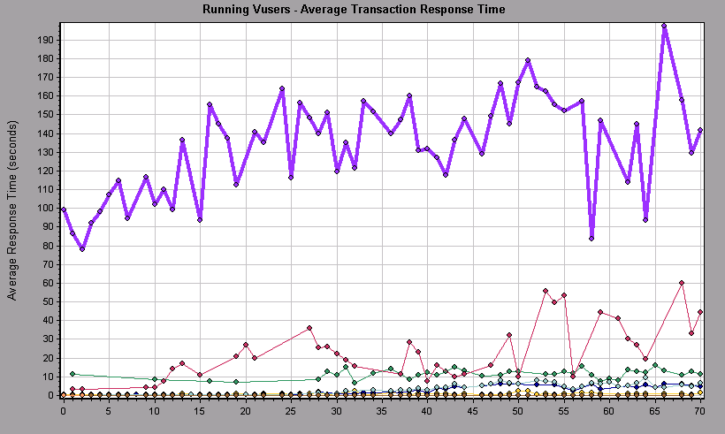
4 Analyze the correlated graph.
In this graph you can see that as the number of Vusers increases, the average response time of the check_itinerary transaction very gradually increases. In other words, the average response time steadily increases as the load increases.
At 64 Vusers, there is a sudden, sharp increase in the average response time. We say that the test broke the server. The response time clearly began to degrade when there were more than 64 Vusers running simultaneously.
| About Load Runner | Creating scripts in Load Runner | Load Runner scenario | LR Analysis | Performance Tuning | Performance Testing | LR Errors | Interview Question | Load Runner Tool | Correlation Practice | Site Map |